LSKD Commercial Bay: Designing One Experience Across Two Storefronts
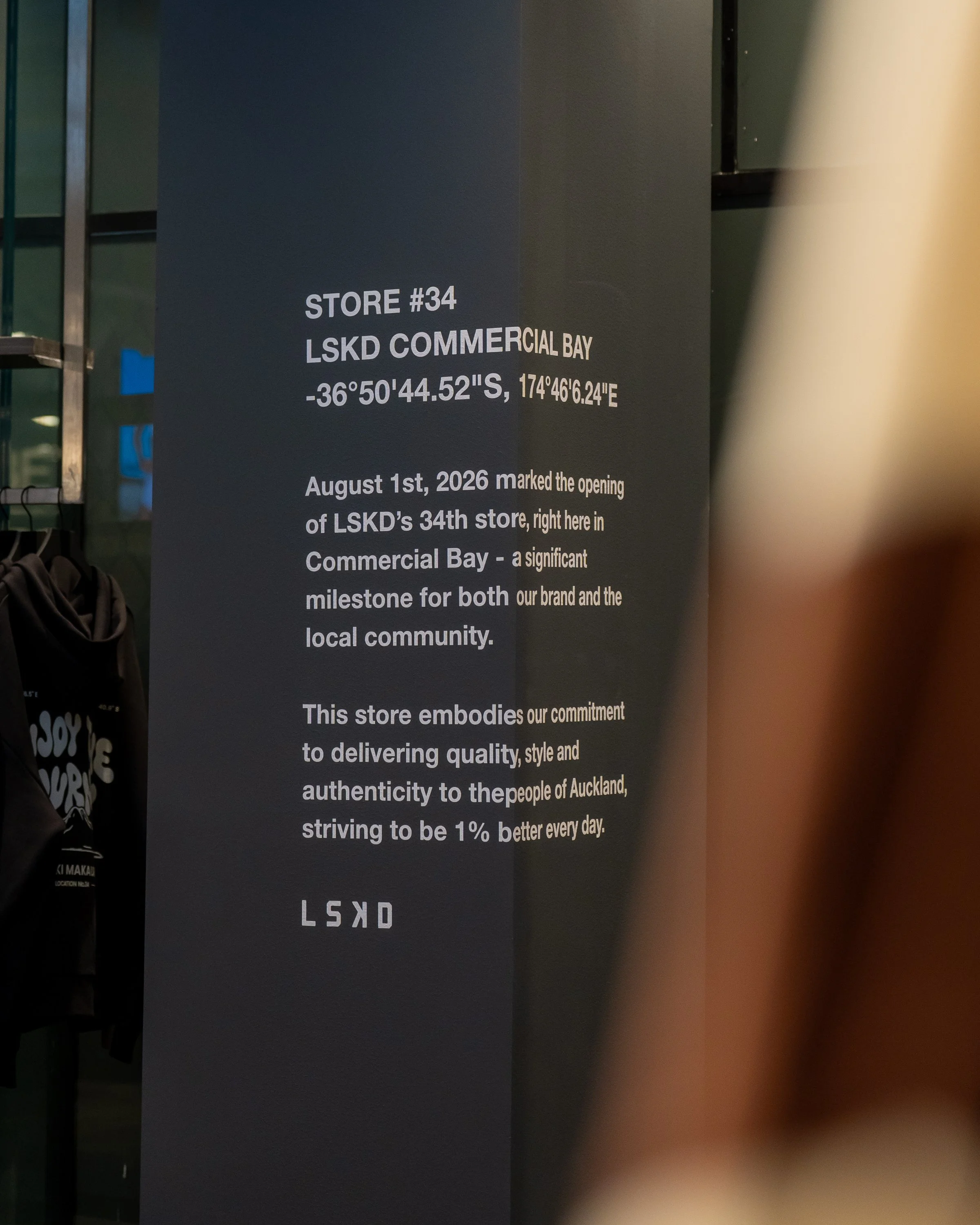
LSKD Commercial Bay is a study in how a strong retail identity can adapt to a completely different site, city and set of constraints without losing what makes the brand recognisable.
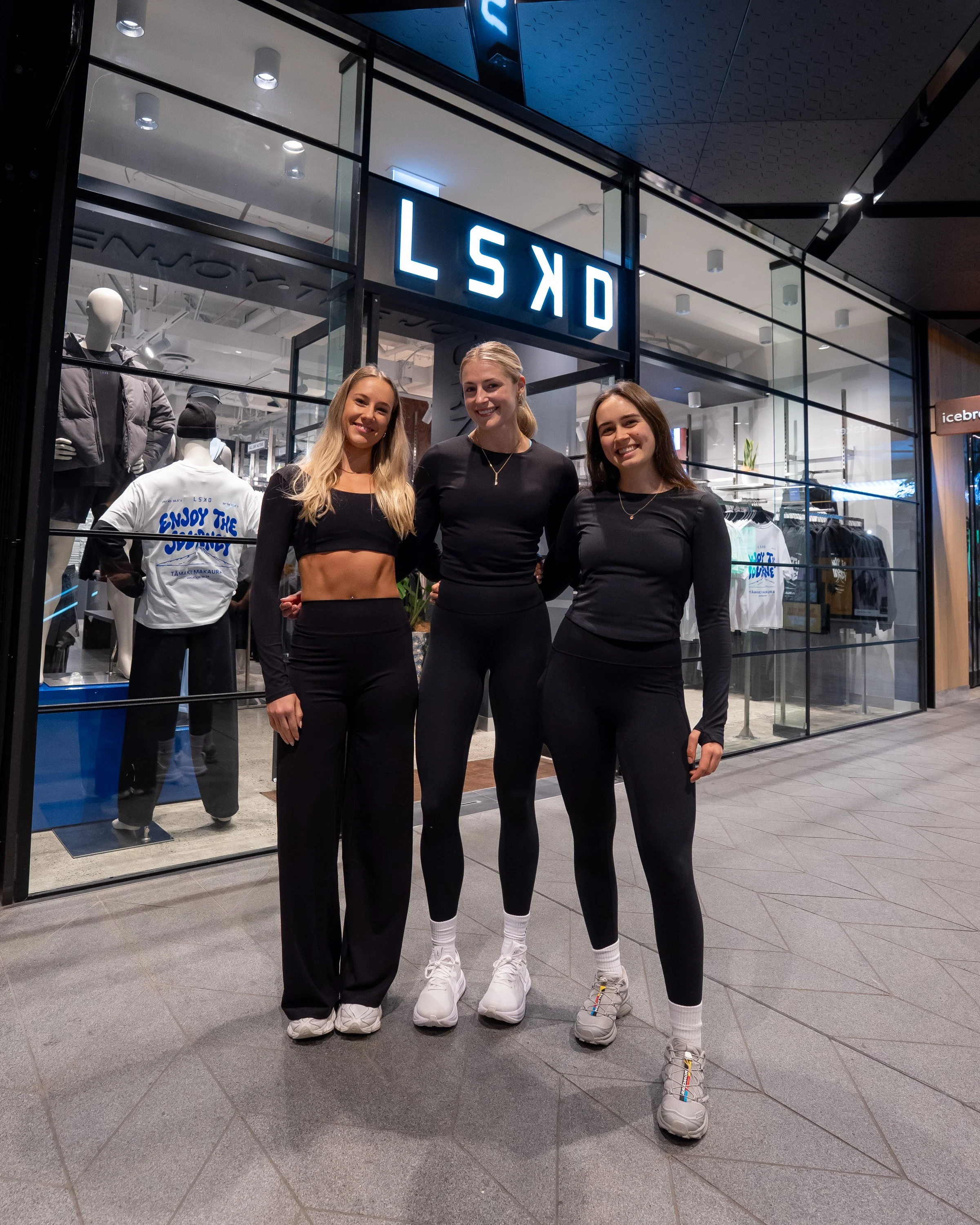
Located within Commercial Bay in central Auckland, the store presented an unusual spatial challenge: a long, narrow footprint connected to two distinct storefronts. Rather than treating those conditions as limitations, they became the starting point for the design.
The objective was to create one cohesive customer experience across both entries — a store that felt intuitive from either direction, maintained strong visual connection throughout and gave product, community and brand storytelling equal presence.
For a fast-growing brand expanding across Australia and internationally, Commercial Bay also raised a larger question: how can a retail system remain consistent while responding meaningfully to local context?
The answer was not to replicate Armadale. It was to evolve the LSKD design language again.

ONE STORE, TWO STOREFRONTS
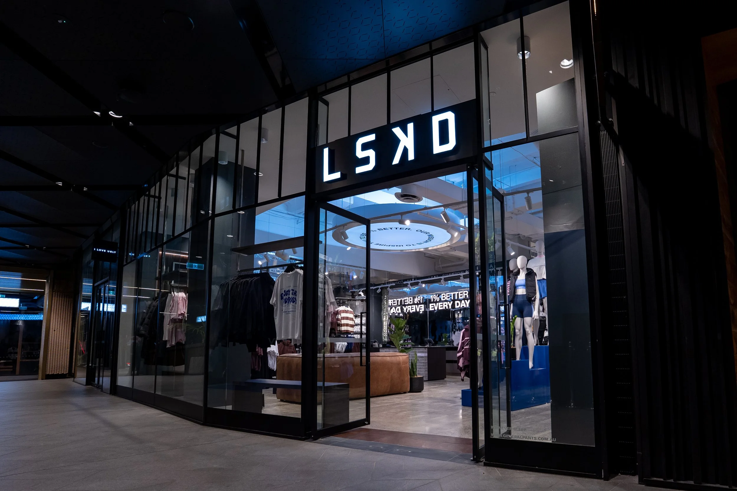
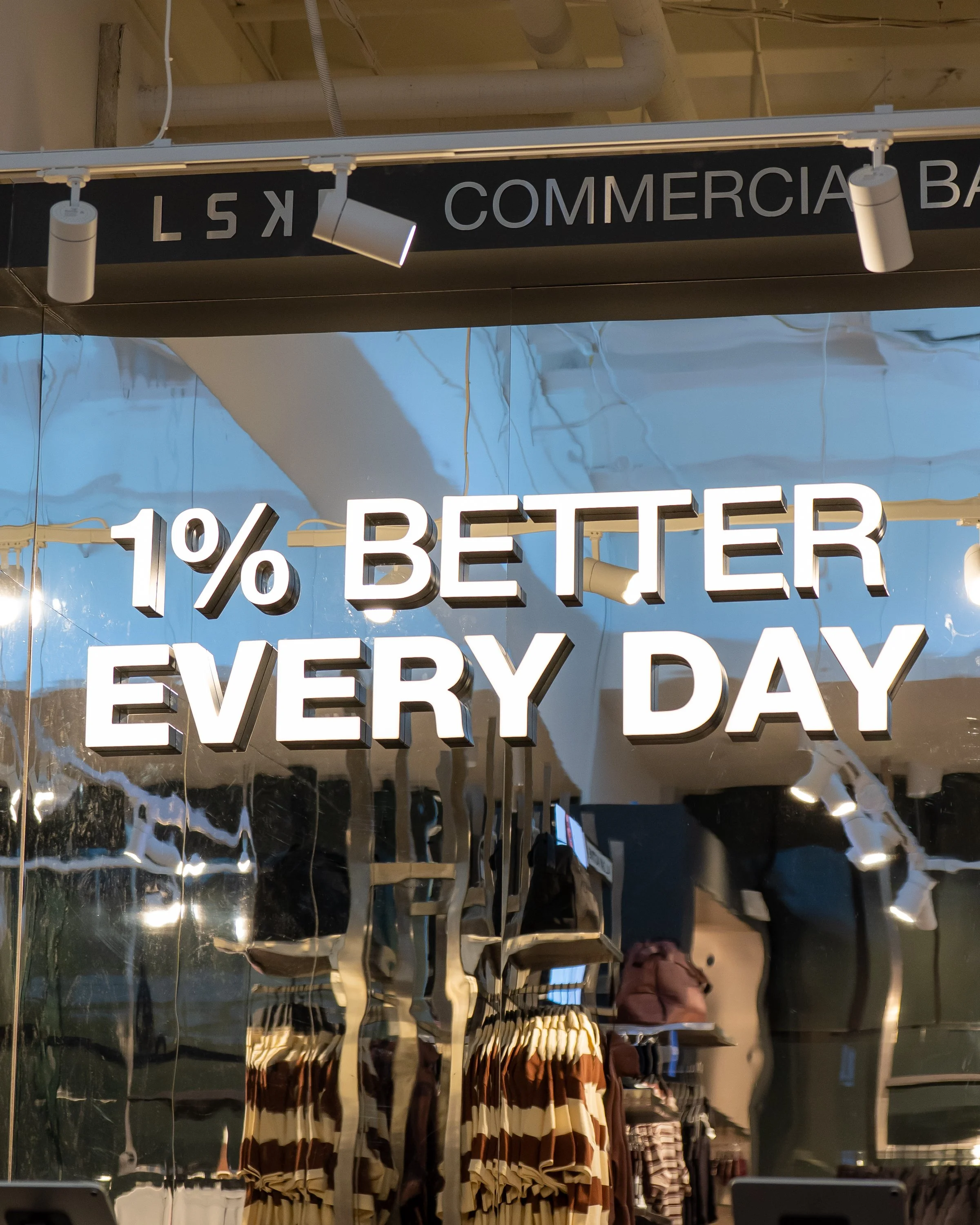
Commercial Bay is not a conventional rectangular tenancy with one obvious front door and a single linear customer journey. The store is long and narrow, with two separate storefronts addressing different parts of the precinct.
That condition created both opportunity and risk. Each entrance needed to feel complete and welcoming in its own right, but neither could read as a secondary entry. Customers arriving from either direction needed to understand the store immediately, see where the journey could take them and remain visually connected to the LSKD experience beyond.
The planning therefore began with connection rather than division.
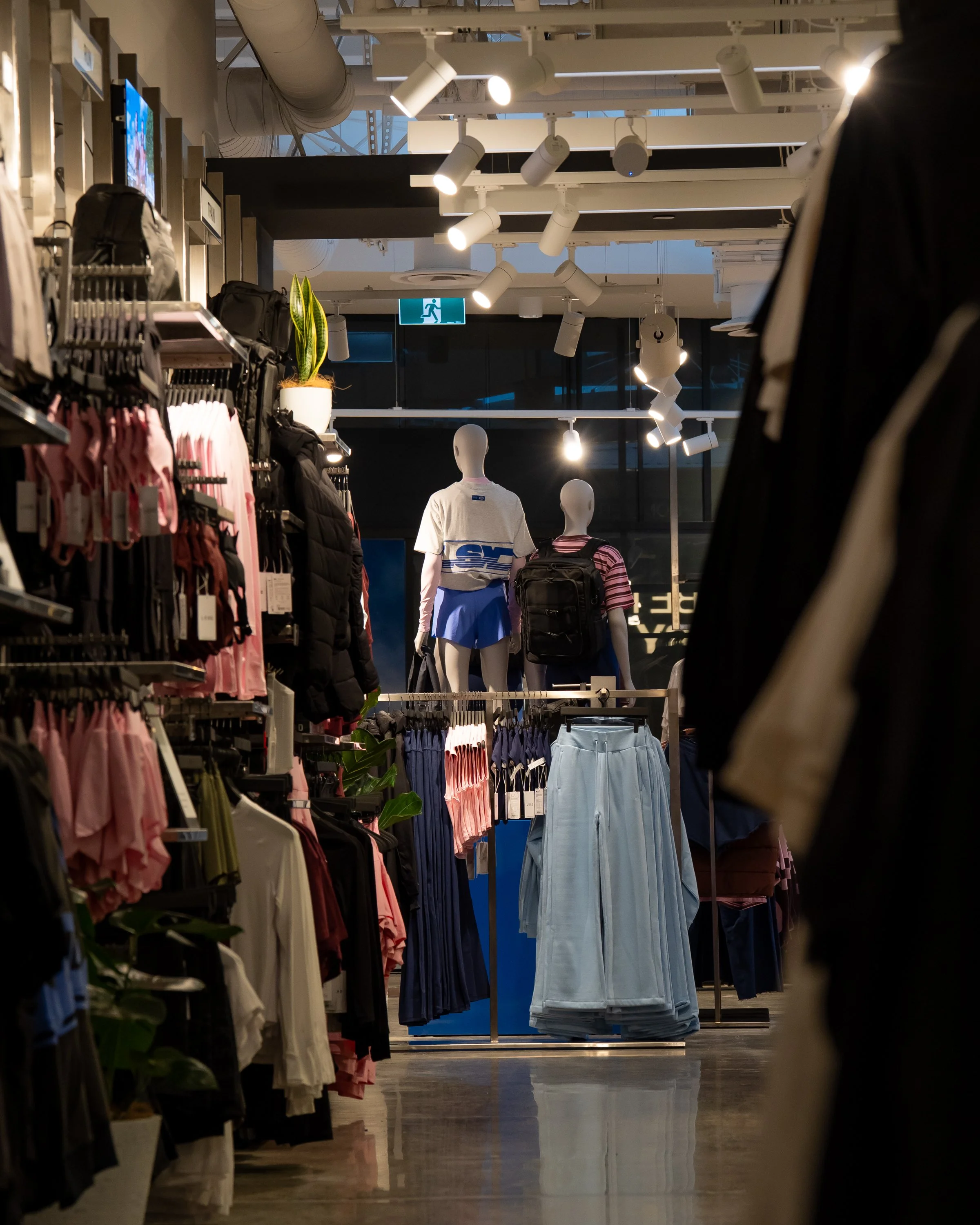
Clear view corridors were protected through the length of the tenancy. Fixtures were positioned to frame movement rather than interrupt it. Key product moments were distributed so that both storefronts carried energy, while the middle of the store became a shared point of orientation.
The result is one experience with two beginnings.
TURNING CONSTRAINT INTO STRUCTURE
In a narrow store, every decision affects what can be seen from the opposite end. Fixture height, product density, lighting and circulation cannot be considered separately.
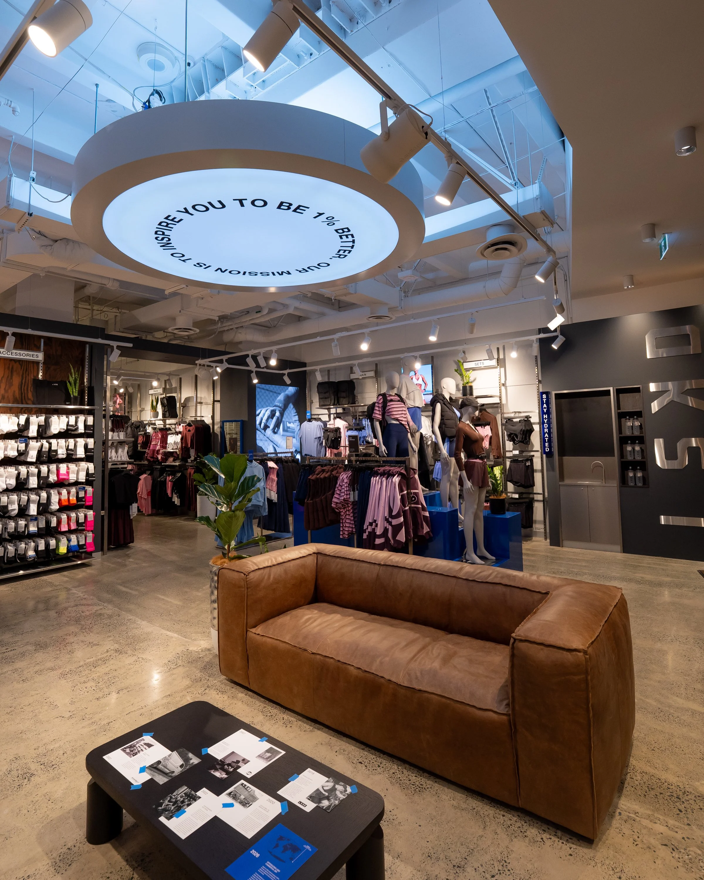
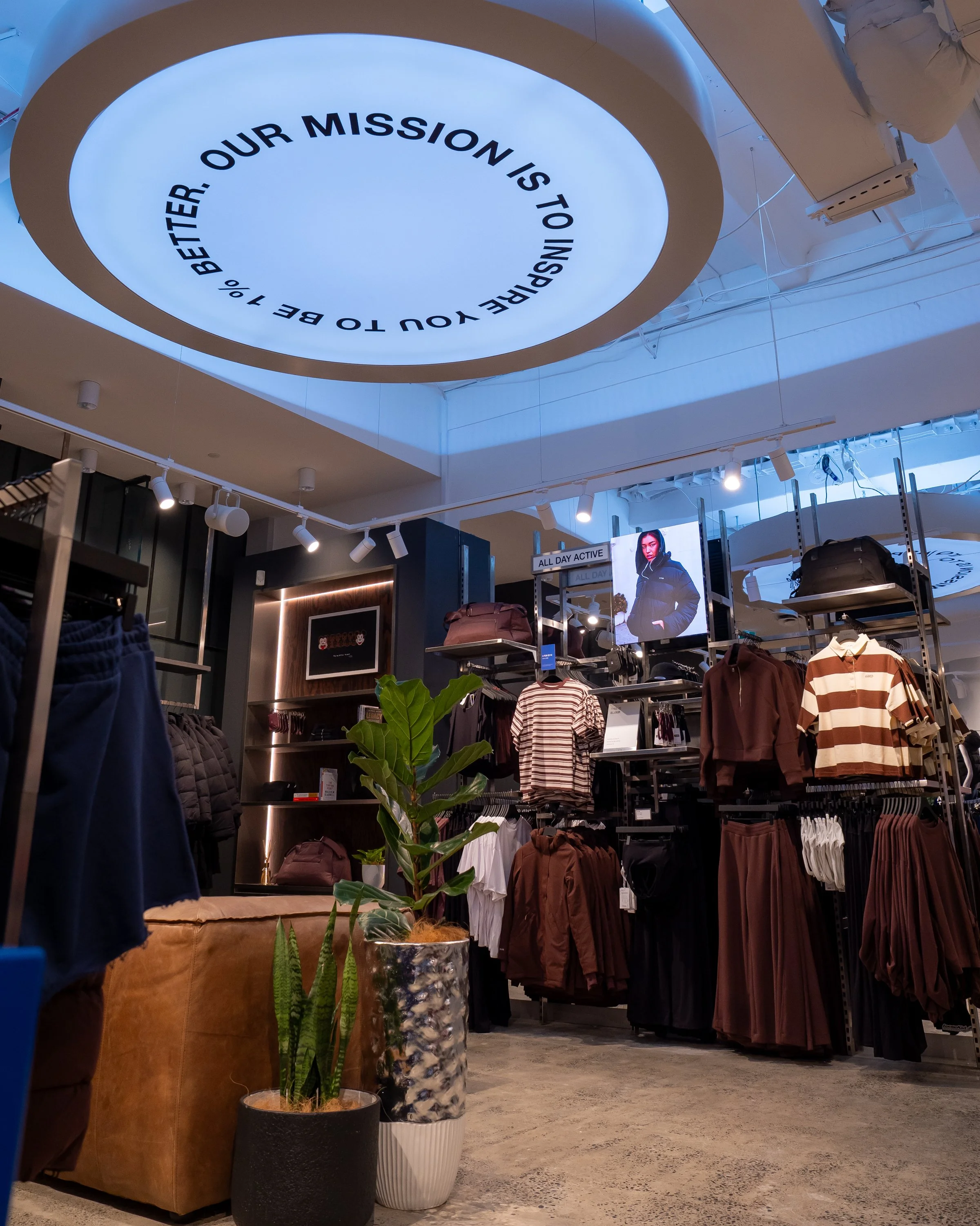
The design uses a strong central axis to make the full depth of the store legible. Pendant lighting reinforces that line of sight, creating rhythm overhead and helping visually connect the two fronts. Lower elements sit within the central zone, while taller merchandising is pushed to the perimeter to preserve openness and make navigation feel natural.
What could have felt compressed instead becomes focused, energetic and easy to read.
THE CENTRAL PODIUM
At the heart of the store, an open central podium acts as both anchor and connector.
Its location is strategic. Visible from both approaches, it creates a moment of pause without closing down the sightline. It gives the team a flexible platform for new collections, campaign stories, launches and changing product priorities while helping customers understand the store as one connected environment.
The podium also introduces a sense of theatre. Rather than filling the narrow plan with a continuous run of conventional fixtures, it creates a deliberate focal point — a place where product can be edited, elevated and experienced from multiple directions.
This flexibility matters because retail is never static. Product stories change. Campaigns shift. Community events bring different demands. The architecture needs enough clarity to feel permanent and enough adaptability to keep moving.
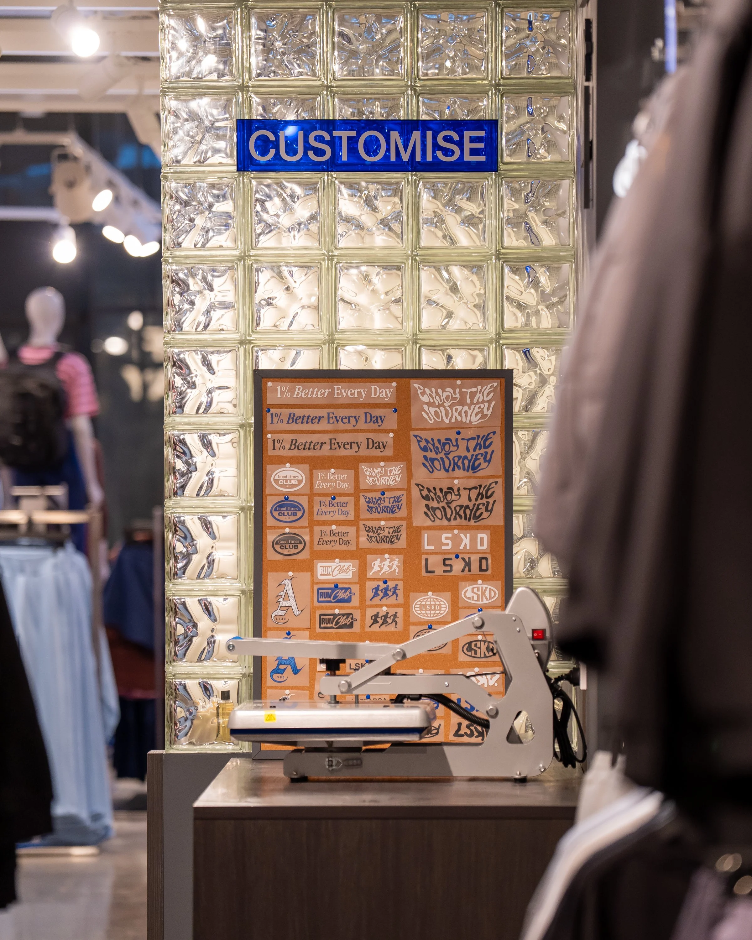
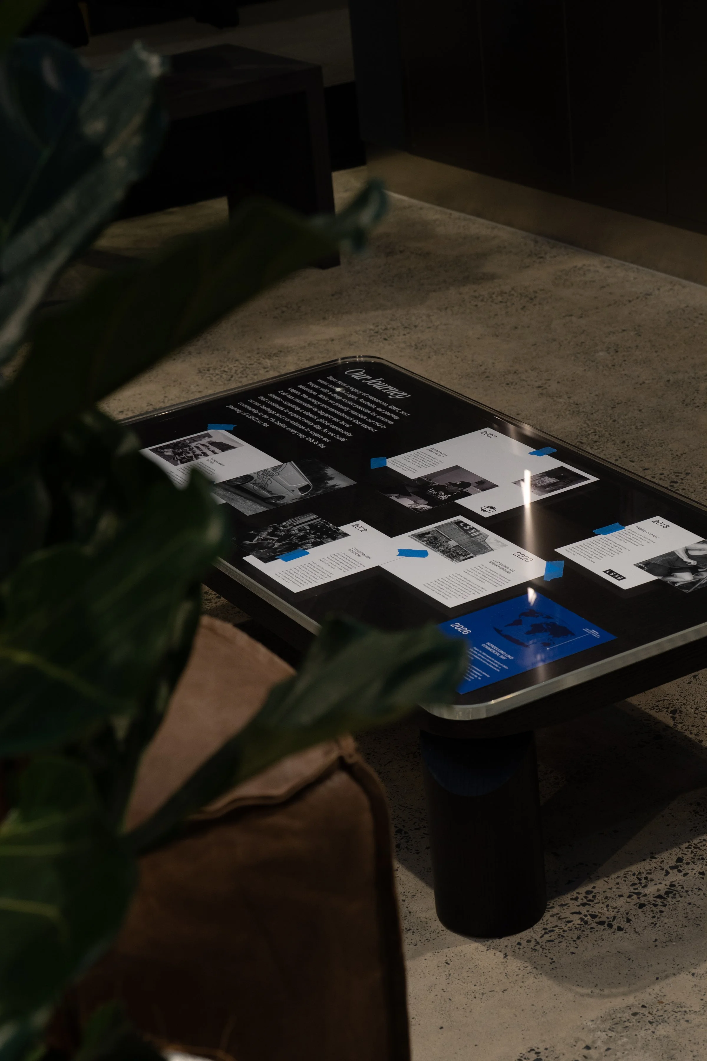
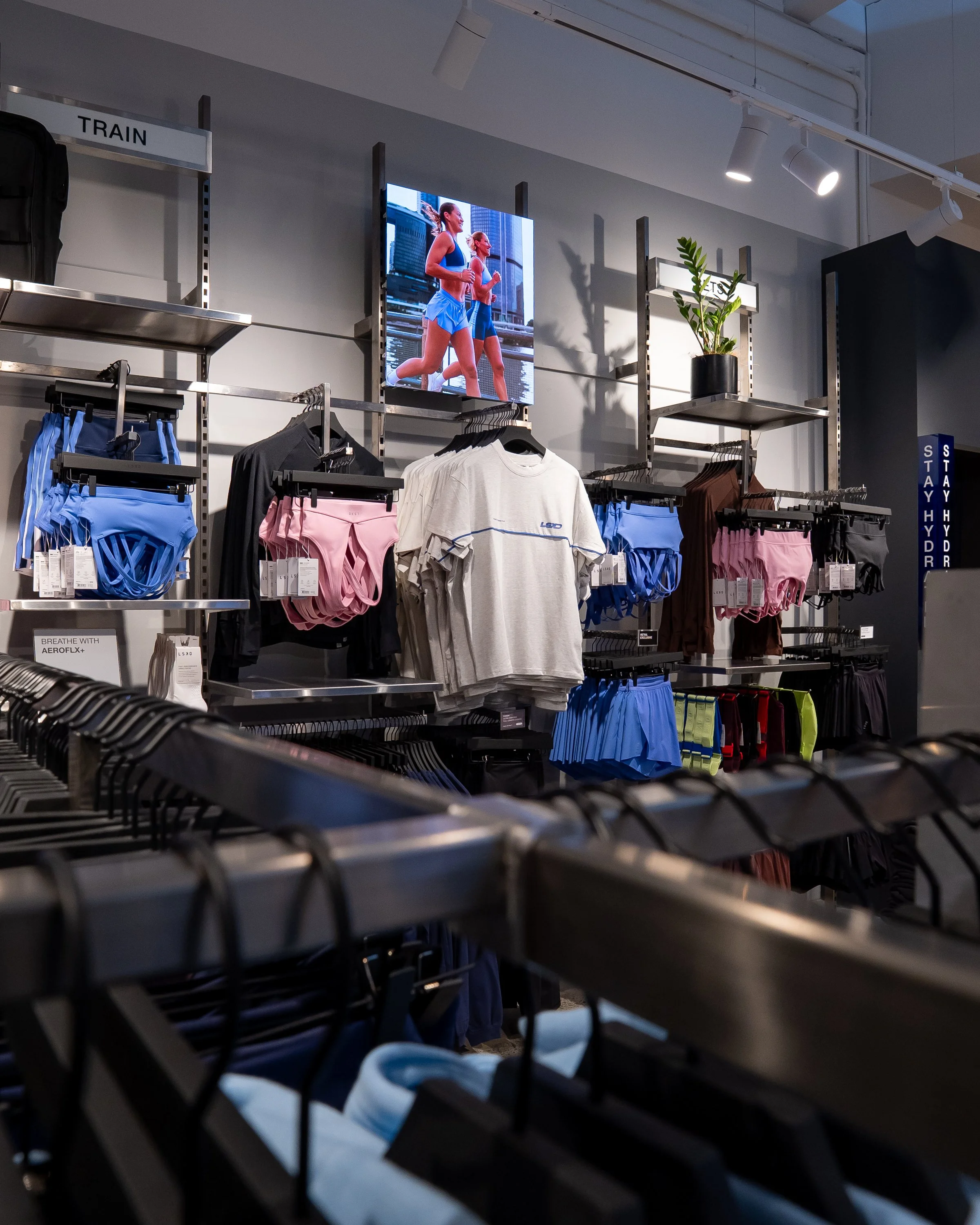
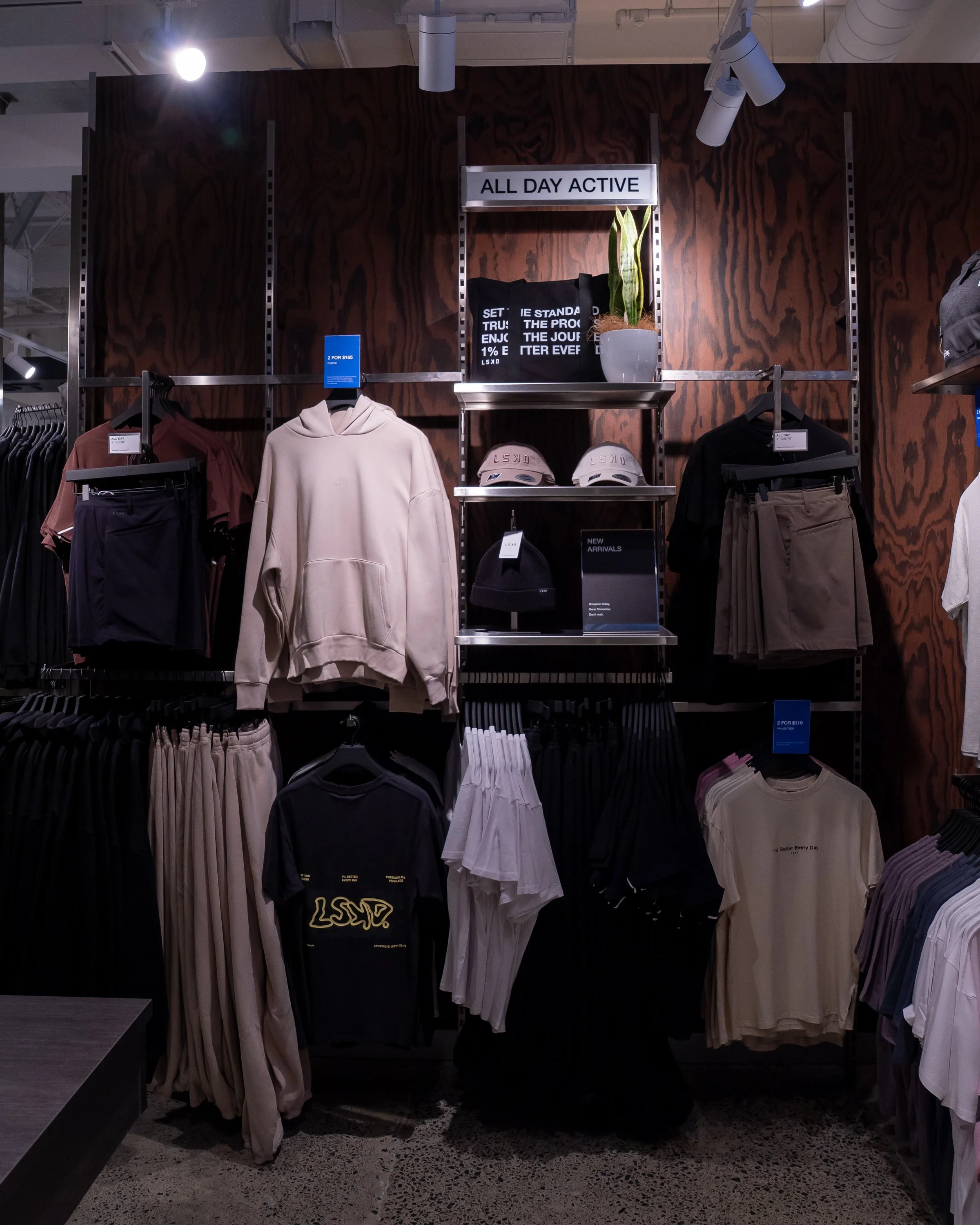
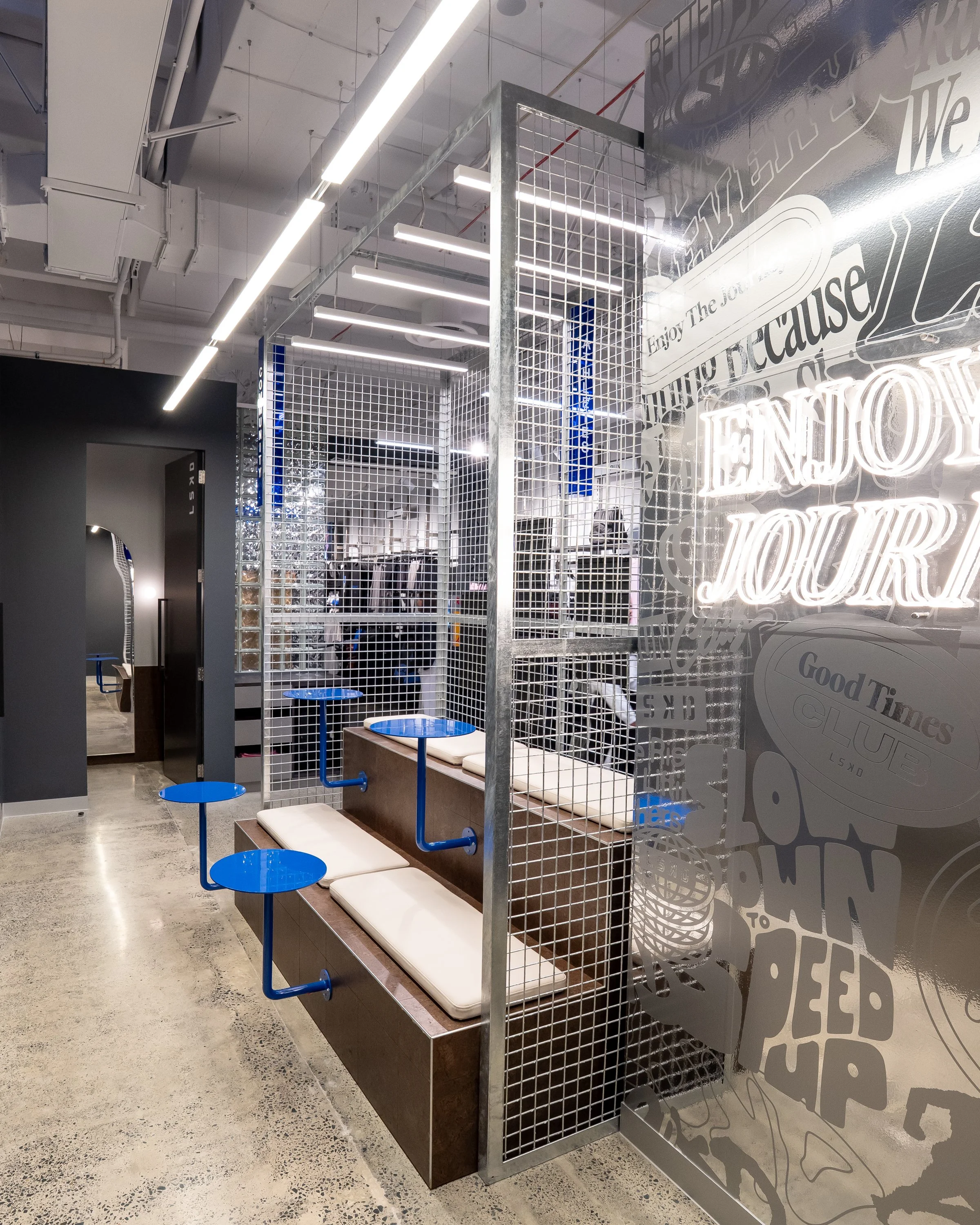
IMAGE CREDIT: LSKD
A DARKER, MORE URBAN EXPRESSION
Commercial Bay develops a darker, more urban expression of the LSKD retail identity.
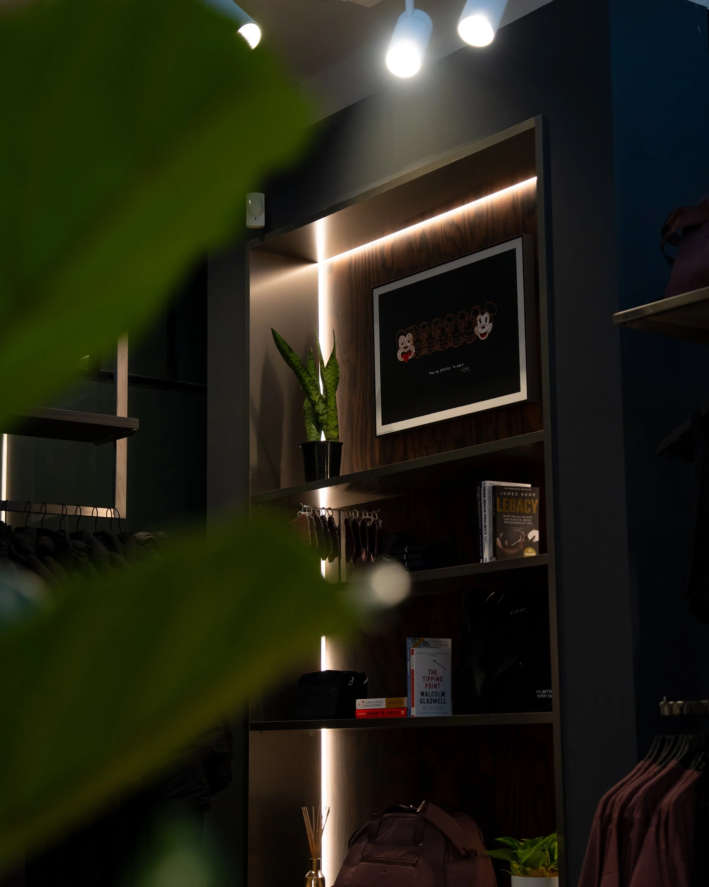
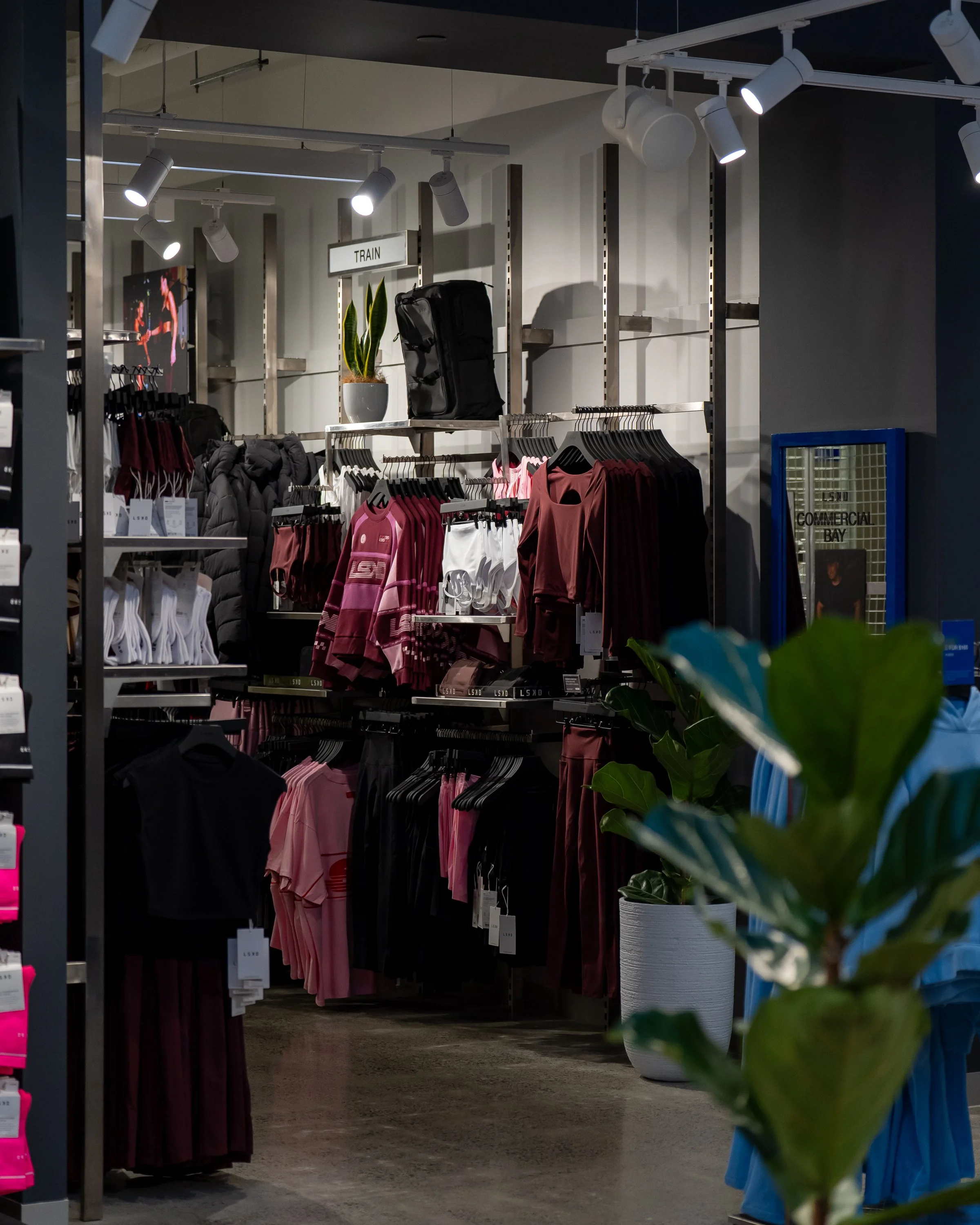
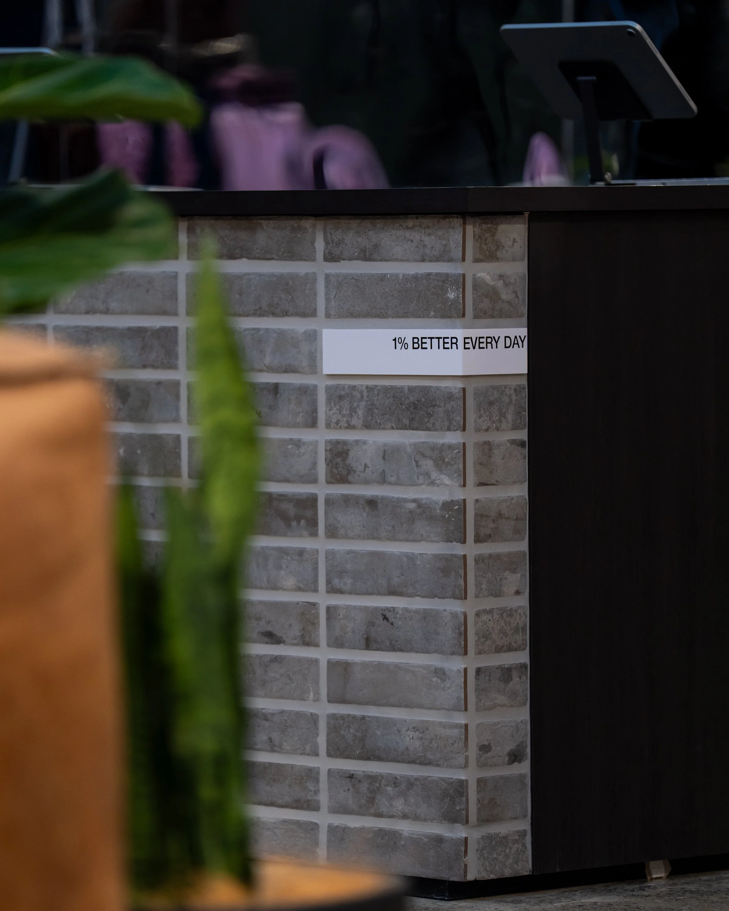
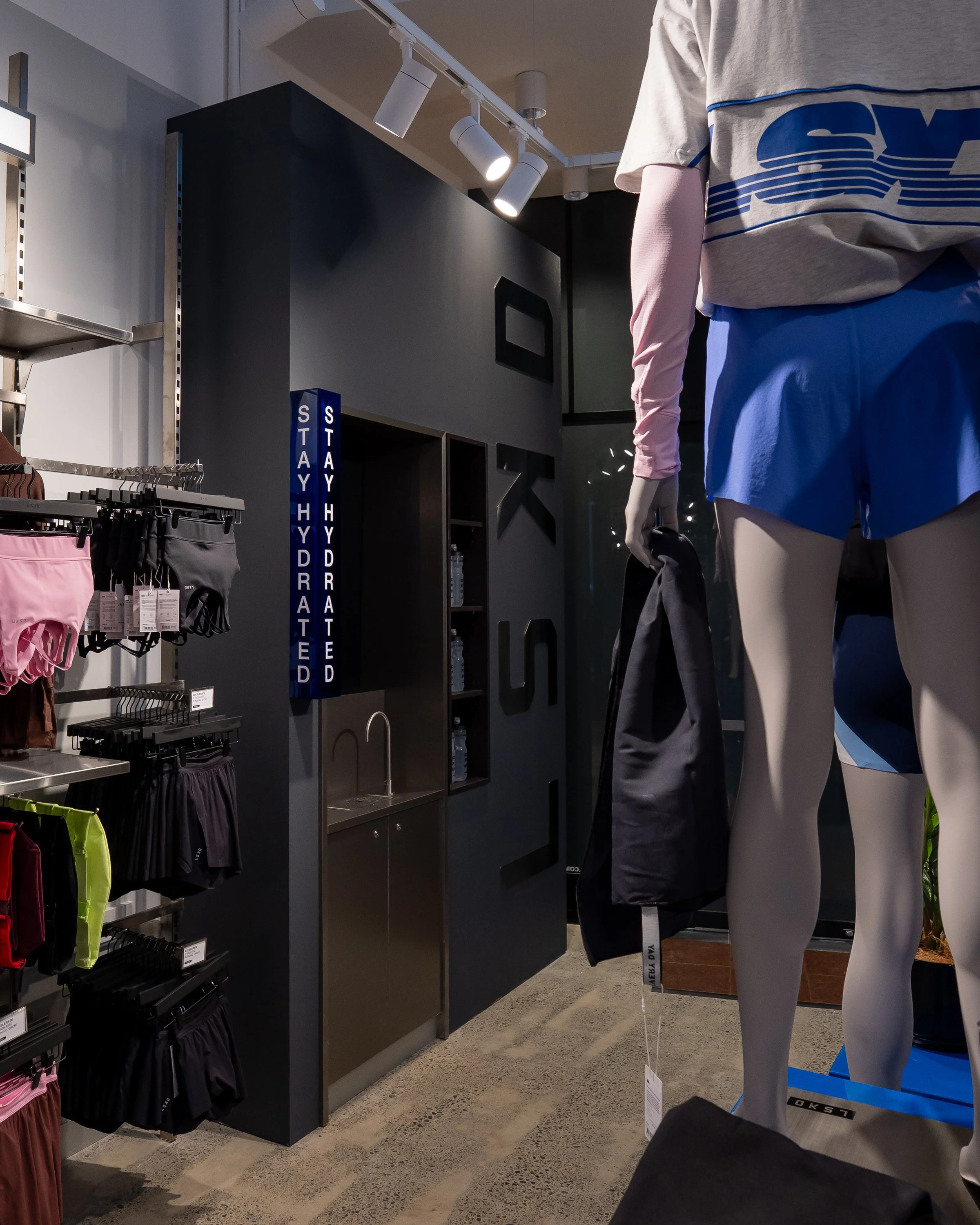
The material palette has more depth and contrast than Armadale, responding to the Auckland city-centre setting and the character of the Commercial Bay precinct. Dark surfaces create a strong architectural base, while stainless steel introduces the technical, performance-driven quality that has become central to the wider LSKD store language.
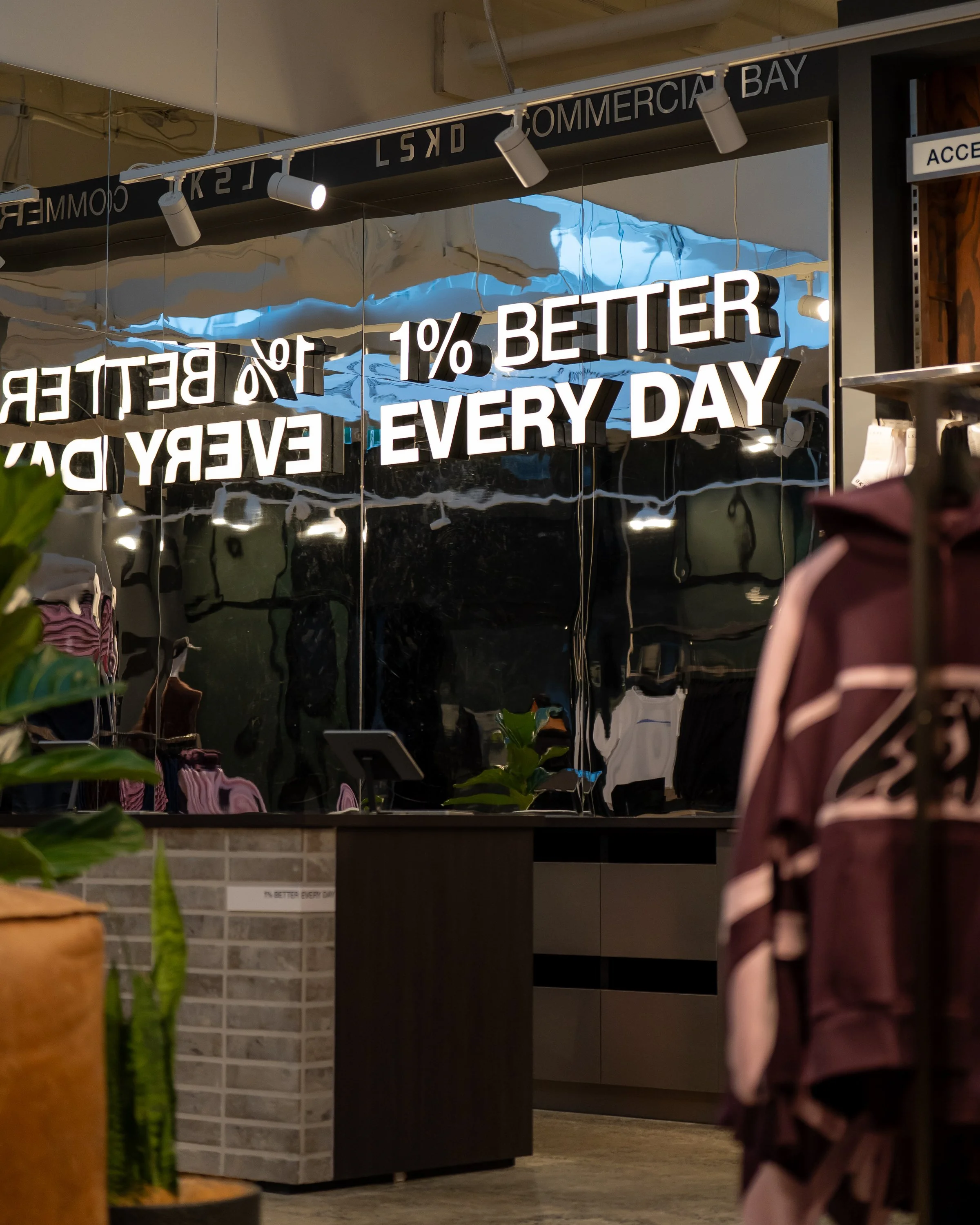
Against this darker backdrop, product colour becomes more vivid. LSKD blue moments feel sharper. Illuminated graphics, digital content and brand messaging carry greater visual impact.
The design is deliberately confident without becoming overworked. Each material has a clear role: to guide, frame, highlight or support the customer experience.
DESIGNING FOR PRODUCT — AND PEOPLE
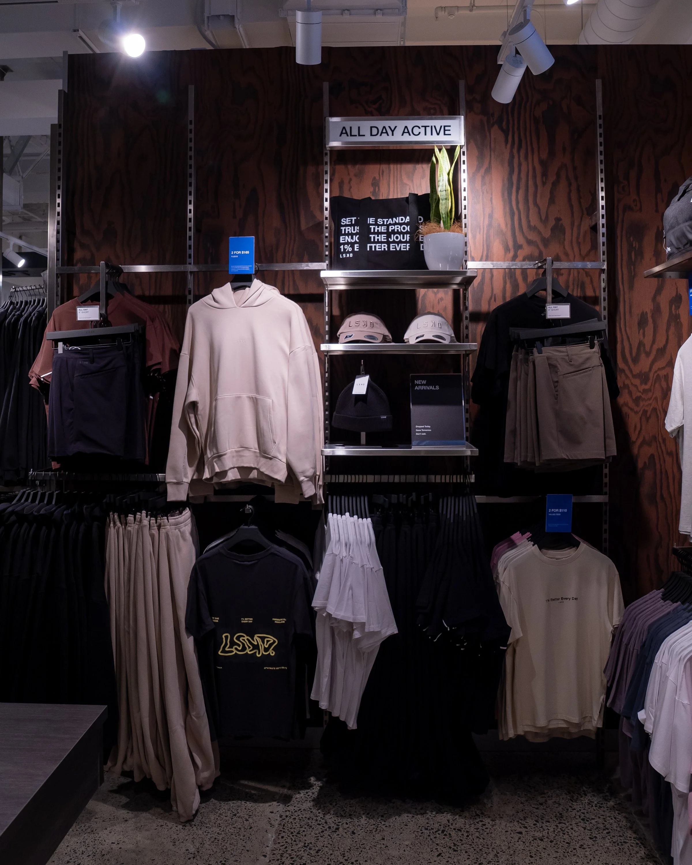
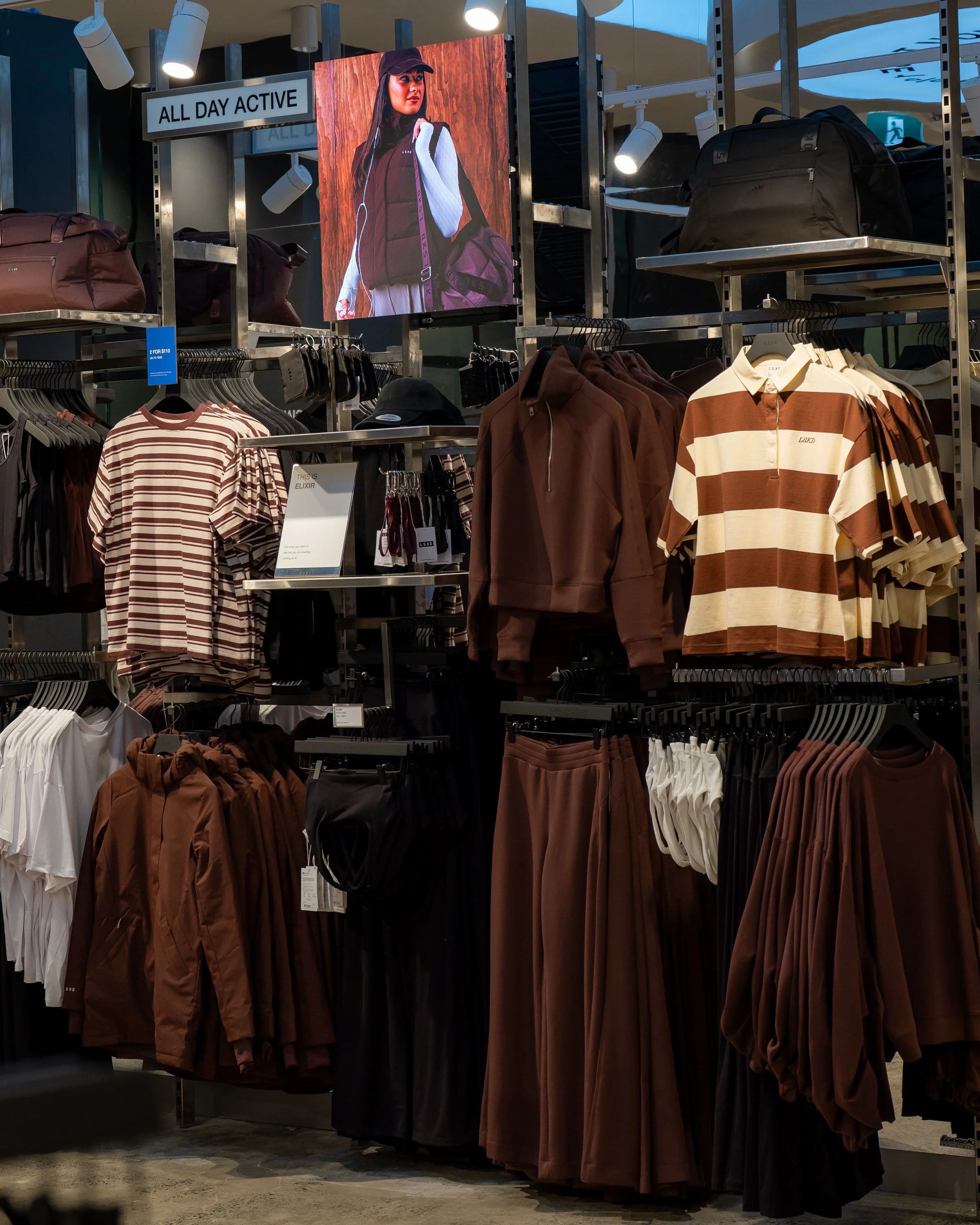
Commercial performance remained fundamental throughout the design. The store needed strong merchandising capacity, intuitive category navigation and enough flexibility to respond to changing collections without compromising the spatial experience.
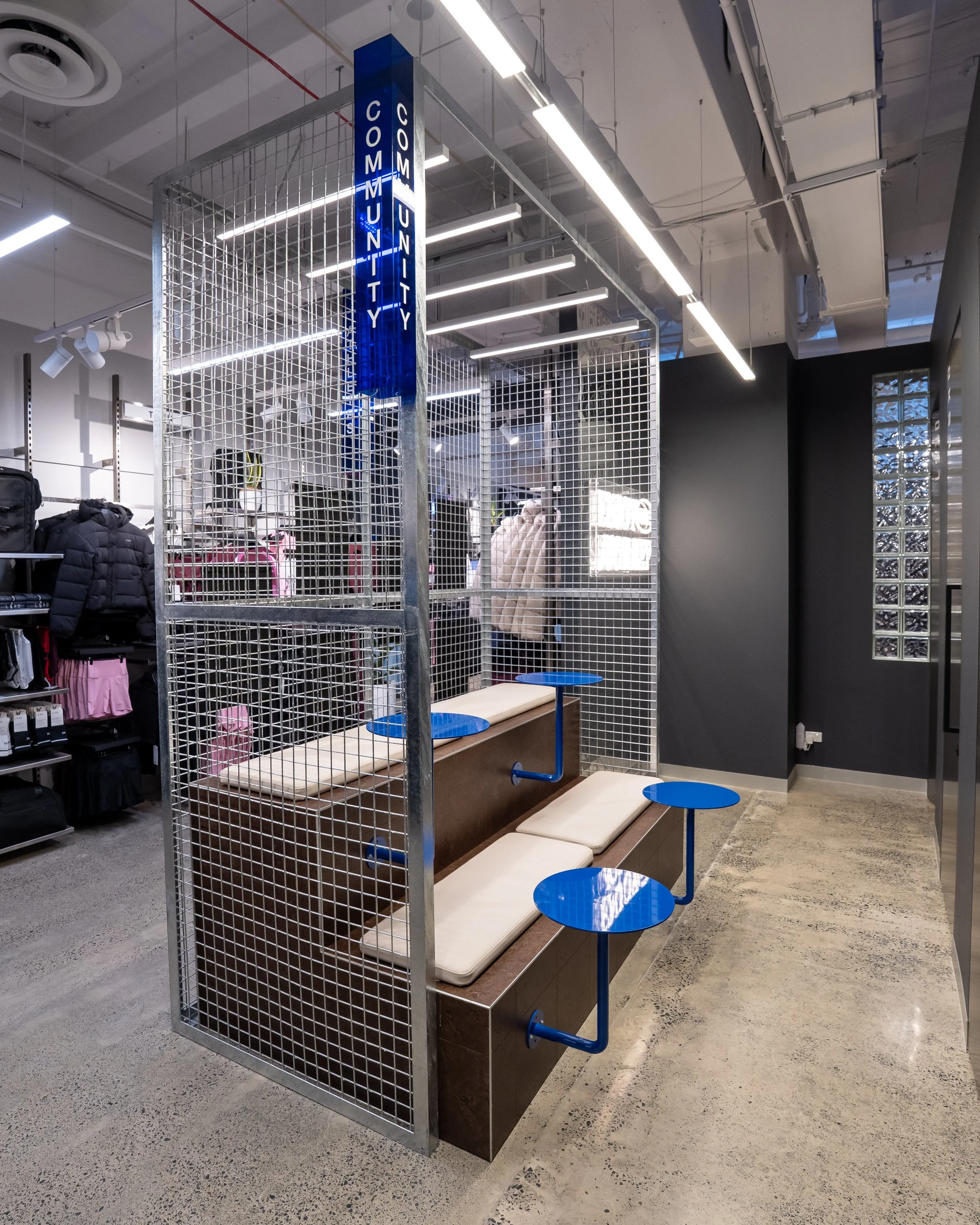
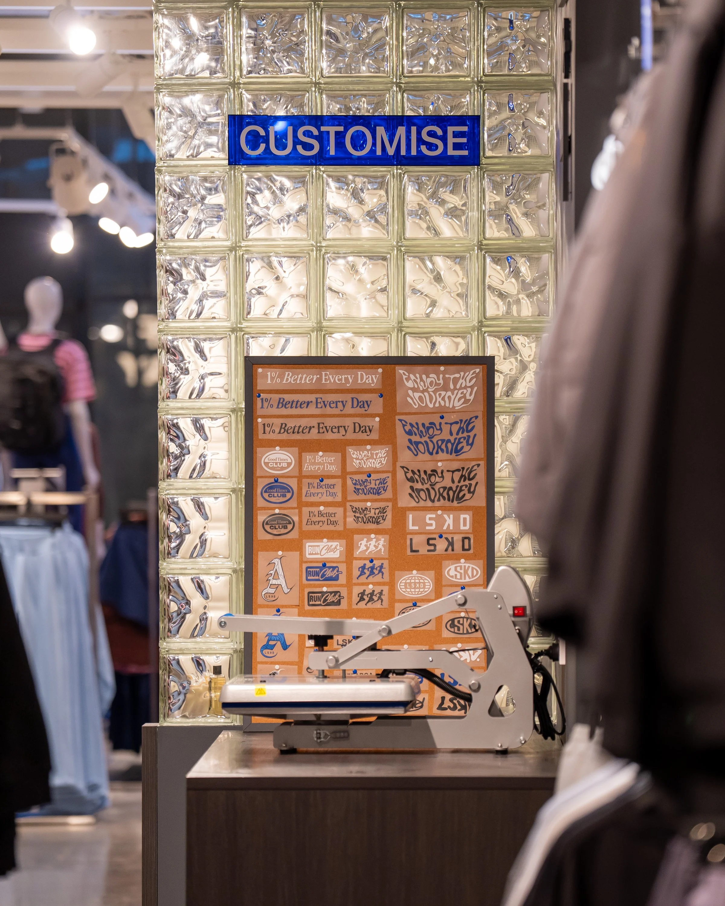
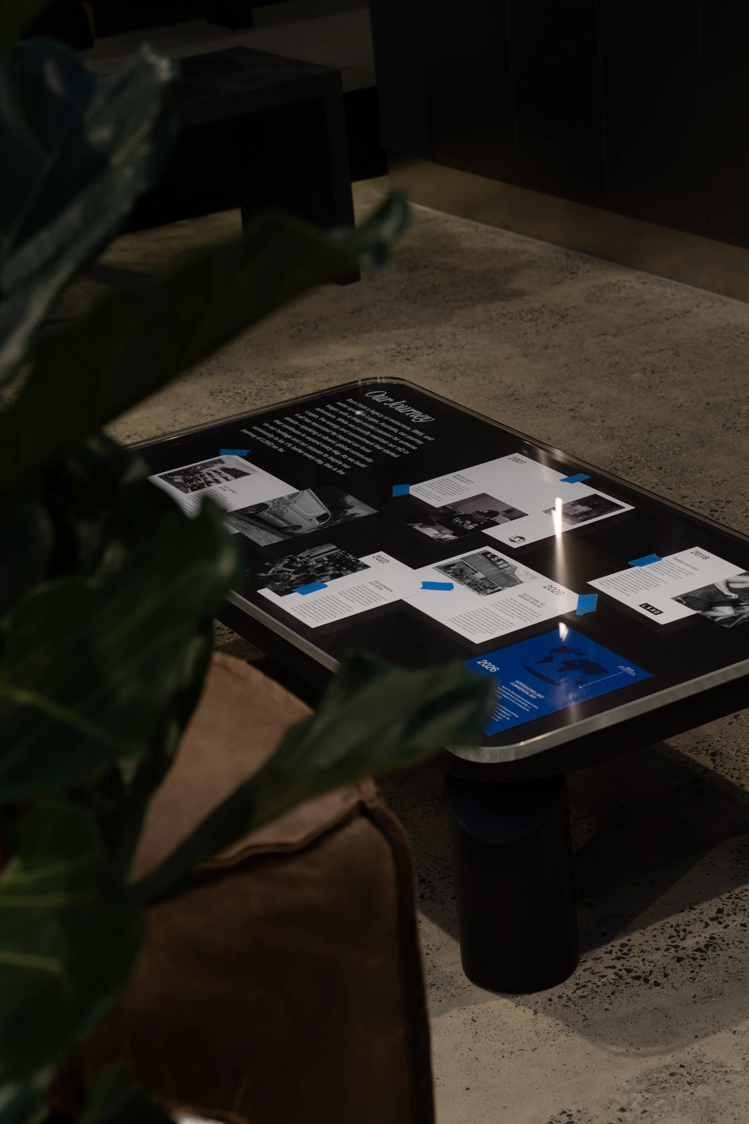
But LSKD stores are not only places to buy activewear. They are places where the team meets its community, where customers discover the brand and where connection often matters as much as transaction.
The community and customisation area was therefore integrated as part of the journey rather than treated as an isolated add-on. Positioned alongside the fitting-room experience, it creates a more personal zone within the store — one that supports conversation, service and the moments that turn a visit into a relationship with the brand.
The fitting rooms themselves were considered as experiential spaces. Lighting, mirrors, graphics and material details extend the LSKD identity into an area that is often treated as purely functional.
These moments matter. They influence how a customer feels in the product, how long they stay and what they remember after leaving.
THE DETAILS HOLD IT TOGETHER
Across a compact footprint, consistency in the details becomes critical.
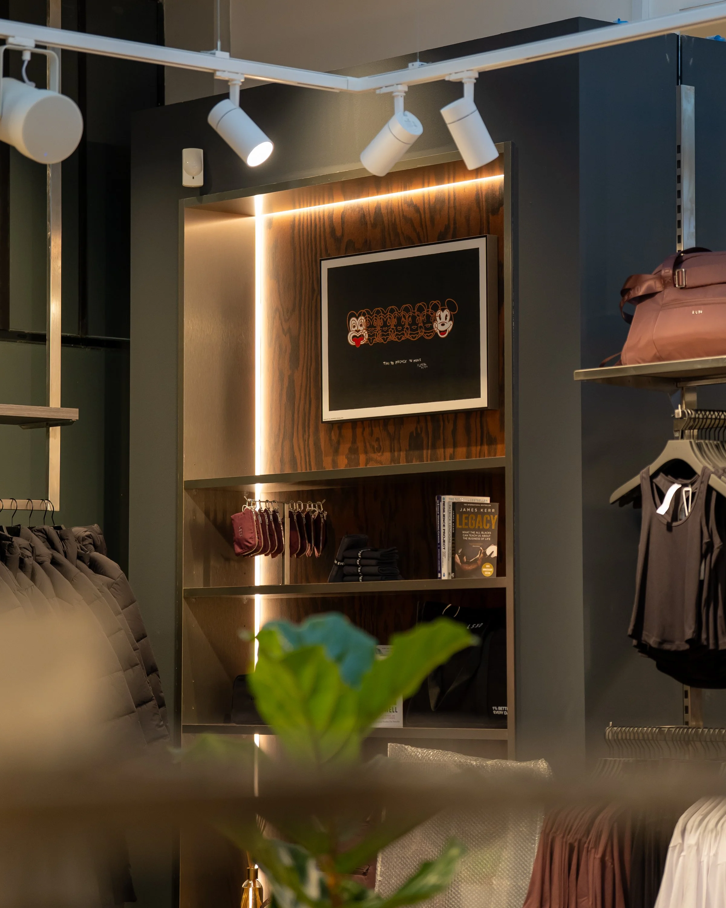
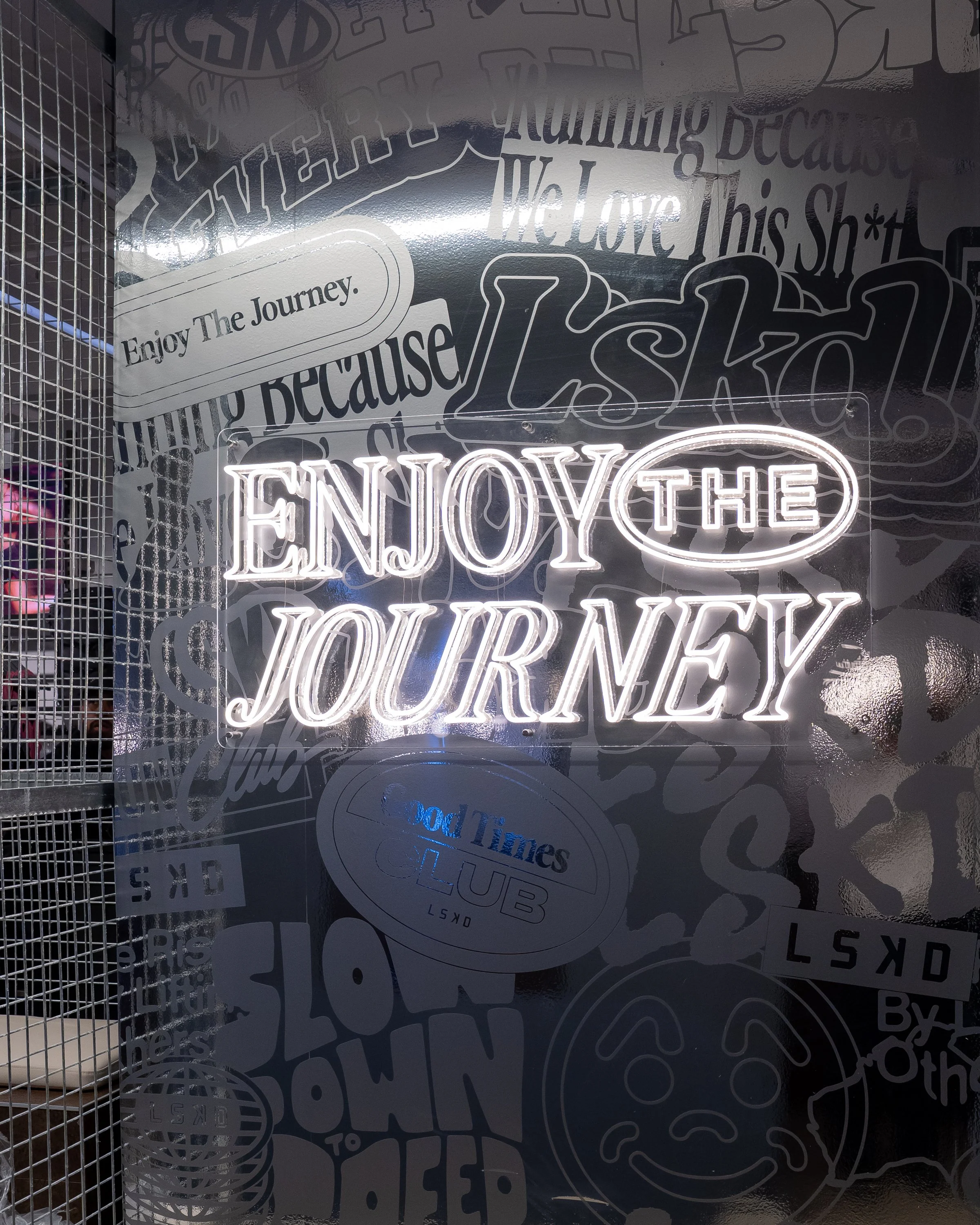
Brushed stainless-steel fixtures provide a precise, durable framework for visual merchandising. Integrated signage and graphics support navigation without adding unnecessary clutter. Lighting is used to create hierarchy, drawing attention to product while reinforcing the long visual connection through the store.
Brand messaging appears as part of the architecture rather than decoration applied at the end. Digital moments introduce movement. Mirrors expand the sense of space. Carefully controlled fixture heights maintain visibility between the two entries.
Individually, these decisions may appear small. Together, they create coherence.
DESIGNING ACROSS THE TASMAN
Delivering an international store adds another layer to the design process.
Commercial Bay required decisions to be made across different teams, suppliers, time zones and procurement pathways. Elements developed in Australia needed to be coordinated for a New Zealand site, with transport, lead times and installation sequencing considered alongside the design itself.
Those practical realities do not sit outside creative work. They shape it.
A strong concept must survive documentation, procurement, shipping and construction. It needs enough clarity that every collaborator understands the intent, and enough flexibility to respond when site conditions or delivery constraints change.
Commercial Bay reinforced the importance of designing not only the finished environment, but the system required to deliver it.
BUILT THROUGH COLLABORATION
A project of this complexity is never the work of one person.
I am incredibly grateful to LSKD founder Jason Daniel for the trust and opportunity to continue shaping the brand’s evolving physical retail experience across Australia and internationally.
Commercial Bay was strengthened through collaboration with the wider LSKD team, bringing together knowledge from development and delivery, finance, fashion and product design, graphic design, visual merchandising, events and retail.
LPA contributed specialist lighting expertise, while By Proxy translated the design intent into construction documentation and coordinated the project through delivery.
Every discipline brought a different perspective. Product needs informed capacity. Retail operations tested the customer journey. Visual merchandising challenged flexibility. Delivery realities refined details. Each conversation helped move the design from an idea into a working store.
The result belongs to a team united by the same ambition: to create an LSKD experience that feels unmistakably its own.
CONSISTENCY WITHOUT SAMENESS
Commercial Bay demonstrates why a retail identity should operate as a system rather than a fixed template.
There are recognisable elements that connect the store to the wider LSKD family: technical metalwork, confident brand messaging, integrated lighting, flexible merchandising and a strong relationship between performance and community.
But the expression is specific to Auckland.
The darker palette, two-fronted journey and central podium respond directly to the site. The store feels connected to Armadale without repeating it. It carries the same attitude while speaking with a different spatial voice.
For a growing global brand, that balance is critical. Consistency builds recognition, but sameness can erase context. The strongest retail systems create a clear family resemblance while leaving room for each location to have its own character.
1% BETTER RETAIL
Like every LSKD project, Commercial Bay created new lessons.
It tested how the design language performs within a tighter footprint. It showed how two storefronts can work together rather than compete. It reinforced the importance of sightlines, fixture height and adaptable central space. It also revealed how design intent must be protected through the realities of international coordination and delivery.
Those learnings now become part of what comes next.
The aim has never been to create a finished formula. It is to build a retail system that keeps evolving — one store, one decision and one improvement at a time.
WHAT’S NEXT
Commercial Bay marks another step in LSKD’s transition from a fast-growing activewear business into a globally recognisable physical brand experience.
It proves that even a challenging footprint can become a source of identity when planning, brand, product and customer experience are considered together from the beginning.
For me, that is where retail design becomes most powerful. Not when every location looks identical, but when every location feels unmistakably connected to the same belief, energy and ambition.
Commercial Bay is LSKD adapted to place: darker, tighter, urban and connected from both directions.
One store. Two storefronts. One evolving global retail language.
PROJECT INFORMATION
Project: LSKD Commercial Bay
Location: Commercial Bay, Auckland, New Zealand
Client: LSKD
Creative Direction & Design: Alexa Nice
Lighting Design: LPA
Construction Documentation & Coordination: By Proxy
Sector: Retail / Activewear / Brand Experience
Completed: 2026
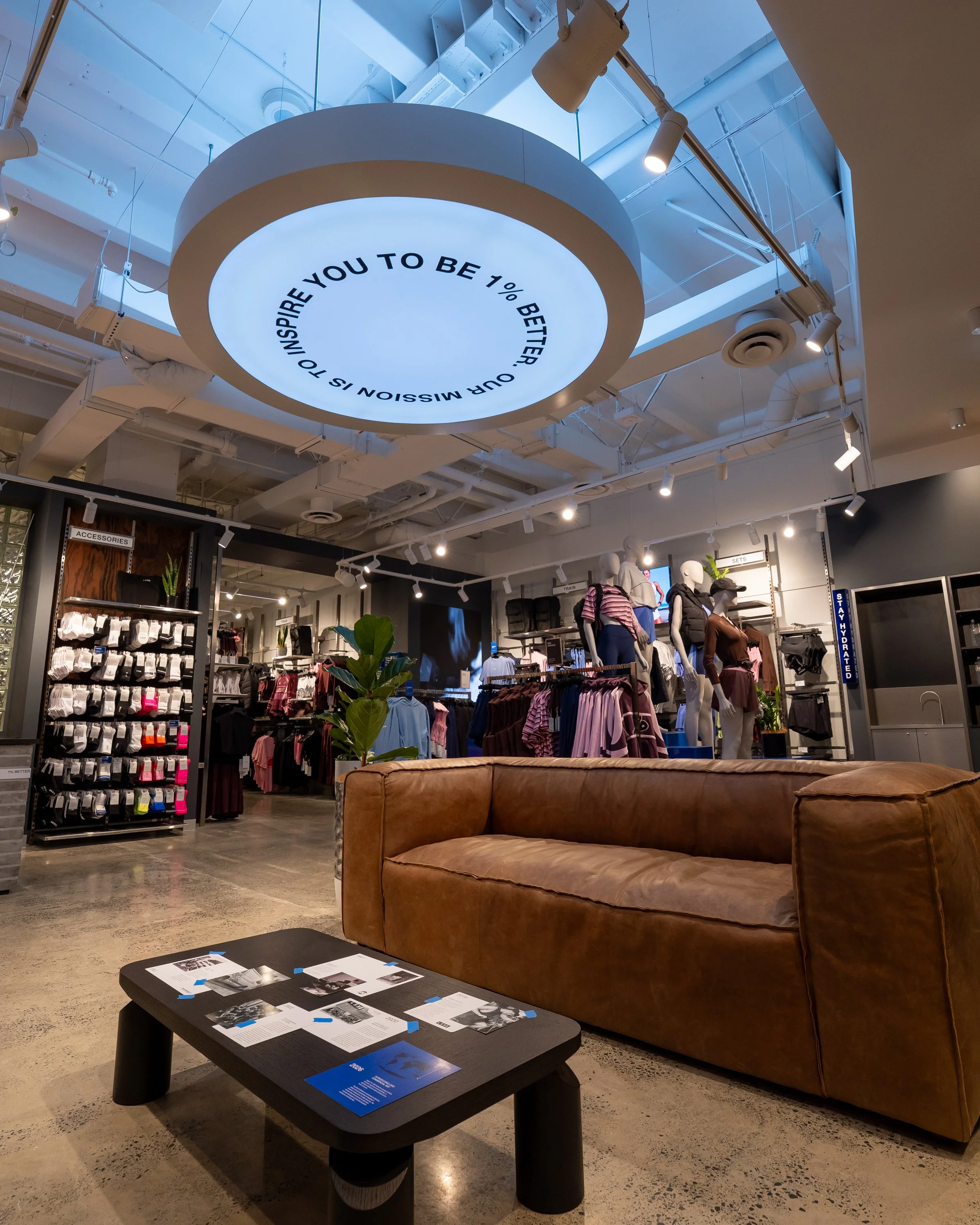
IMAGE CREDITS: LSKD
Great design has the power to shape how we live, how we connect and how we experience a brand.
A—N works across space, brand, culture and technology, creating environments, experiences, identities and new ways of thinking. The practice spans retail, hospitality, hotels and resorts, cultural destinations, commercial environments and emerging technology.
Every project begins with a strong idea and a clear understanding of the people, brand and business behind it. The result is never a prescribed house style. It is a considered response designed to create connection, build value and leave a lasting impression.
Have an ambitious idea, brand or space you would like to bring to life?
Work with Alexa to start the conversation.
Follow the latest projects, ideas and behind-the-scenes stories on Instagram and Pinterest.