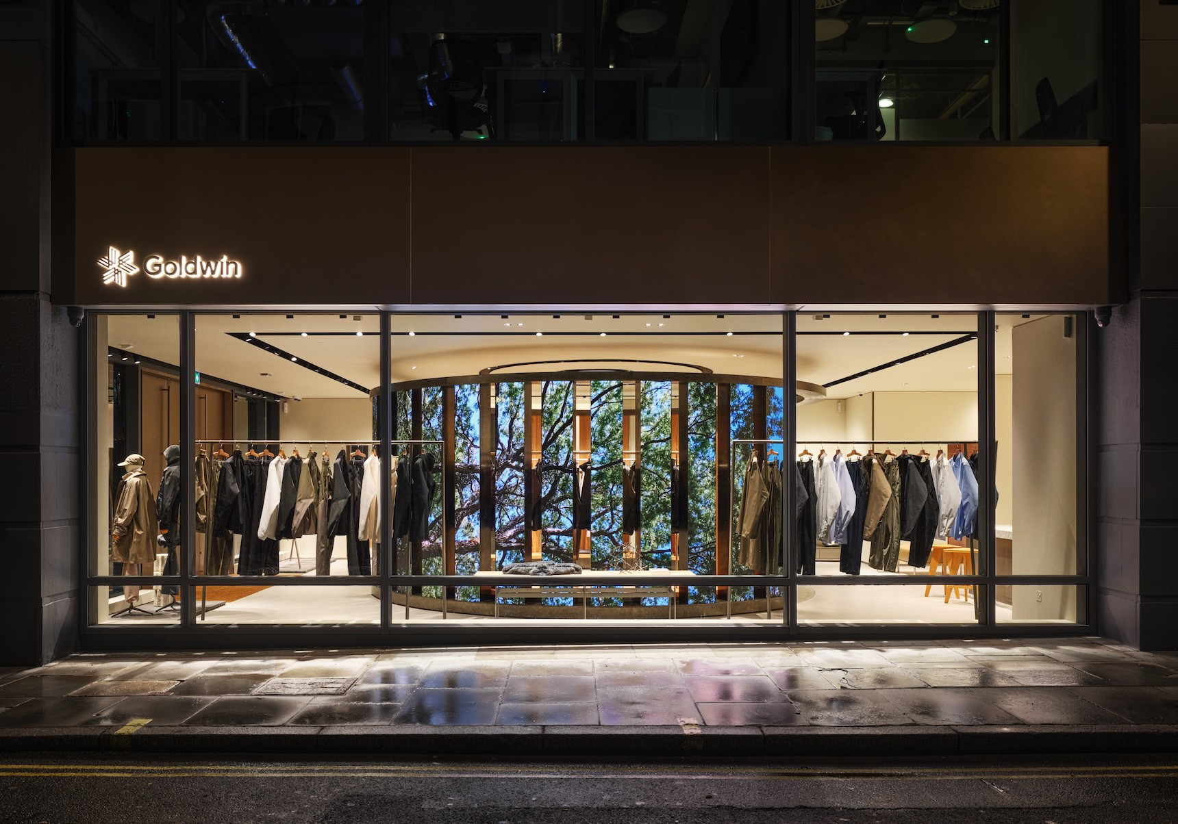
Goldwin London. Image: Goldwin.
IN GOOD FORM / A—N PERSPECTIVE
A store has two lives. One unfolds in the room; the other travels through photographs, films and the people who share them. The relationship between those lives is becoming an architectural question.
I am interested in the decisions that allow an experience to move naturally between the physical and digital worlds. A memorable image can begin with a clear spatial idea, good light and a place where someone feels comfortable experimenting. It also needs to work for the person who never lifts a phone.
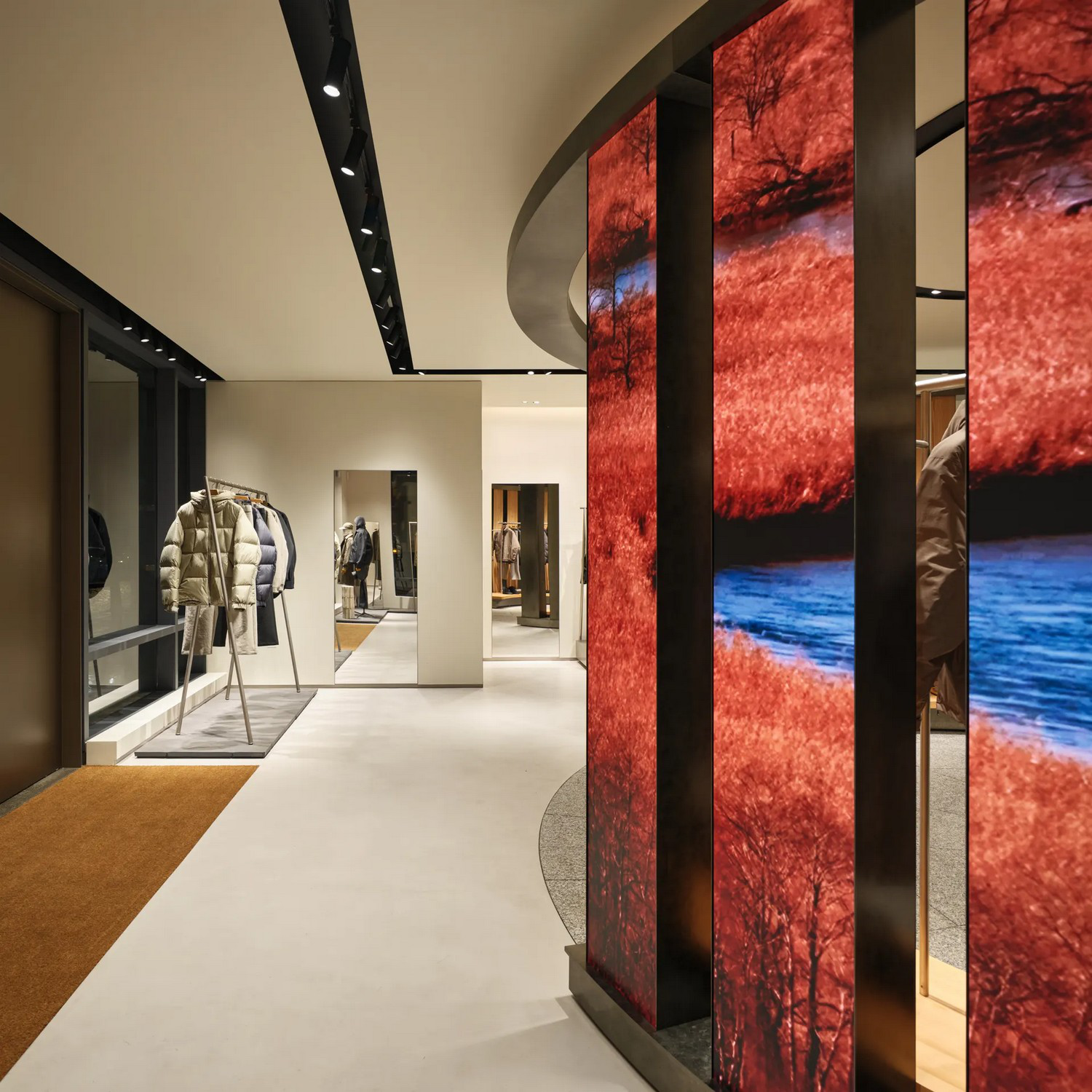
Goldwin London digital colonnade. Image: Goldwin.
Give the street something to read
Goldwin London, which opened on Broadwick Street in January 2026, makes that relationship visible. New Material Research Laboratory organised the store around a ring-shaped yashiro, a shrine-like centre that can be seen through the glazed façade. Twelve vertical LED screens sit around its outer perimeter; an Akita cedar colonnade creates a quieter interior.
The contrast is the useful detail. Moving imagery can communicate with Soho while the timber gives visitors somewhere to settle. Technology and material have different roles within one composition.
My reading is that the content has been given a place in the architecture. The screens are repeated elements around a centre, rather than an isolated device competing with the merchandise. Their position matters as much as the film they carry.
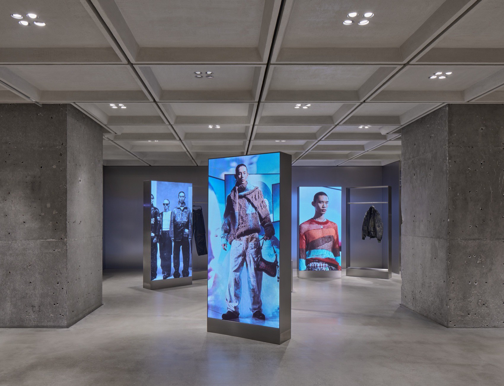
Zara Nanjing. Image: Zara / Bagel Affairs.
Make room for the person making the image
At Zara Fanmao in Nanjing, Bagel Affairs developed Fit Check as an in-store content studio. Its professional multi-camera setup, adjustable lighting and interface allow visitors to direct their own shoots while trying garments.
There is a shift in authorship here. Someone can test movement, styling and angles, then leave with content they have helped create. The room supports an existing behaviour: people already document what they wear.
That makes the design brief quite specific. How much space does a full-length shot need? Where does a companion wait? Is there somewhere to put a bag? Can lighting flatter a person while showing the colour and texture of the product accurately? A camera moment depends on these ordinary decisions.
Design the operating rhythm
A screen requires someone to commission, update and check its content. A studio needs a clear booking or access process, a reset routine and help when equipment fails. Those responsibilities belong beside the floor plan.
For a smaller store, the translation might be a carefully positioned mirror, generous standing space and lighting that works both in person and on camera. The scale can be modest if the experience is deliberate.
I would also ask what happens when the equipment is idle. The room should still feel coherent, merchandise should remain easy to understand and circulation should still work. A feature that needs constant explanation will quickly become a burden for the team.
Let the image carry the experience
The photograph is evidence of what someone found in the store. It can carry a material detail, a garment in motion or a moment with another person.
For me, the best brief begins with that lived experience. Design something people want to encounter, give them a comfortable way to record it and make the everyday operation credible. The image then has a reason to travel.
Curated and written by Alexa Nice | Studio A-N
DESIGN. CULTURE. PROGRESS.